Sherwin-Williams Color Expert™
- 3.8
- Rating
- 500.00K
- Installs
- Free
- Price

 Analysis by App-foxy
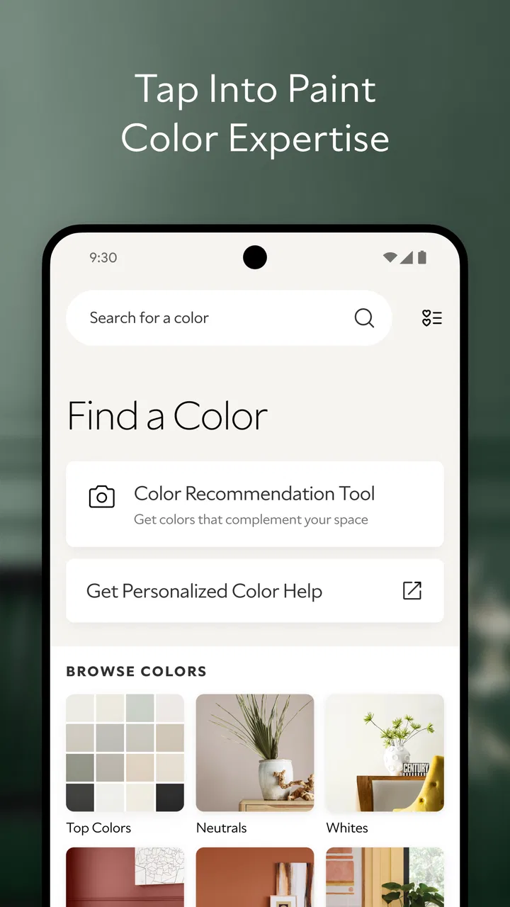
Choosing a wall color sounds simple until you are standing in a paint aisle with several nearly identical swatches in your hand. Sherwin-Williams Color Expert™ is designed for that exact moment: it gives me a way to explore paint colors and visualize them before I commit to a can. As a free House & Home app from Sherwin-Williams, it feels most useful when I treat it as a planning tool rather than a final authority on how a room will look.
I found the app especially helpful for narrowing a large color collection into a manageable shortlist. Instead of relying only on a tiny paper chip or trying to remember how a shade looked in a showroom, I could compare ideas in a more practical setting. The experience is aimed at everyday homeowners, renters planning a refresh, and anyone who wants more confidence before repainting a room. Its Everyone age rating also makes it approachable for family projects where several people want to discuss color choices together.
How I use Color Expert from first idea to paint decision
I use the first pass to get oriented, not to pick a winner: I note what must stay in the room, then compare a few color directions without changing the viewing conditions. That keeps a fresh favorite from distracting me from practical details like flooring and trim. Once I have a shortlist, I can move on to the checks that make the choice more dependable.
You May Also Like

 Blood Strike: 2.5 Anniversary
Blood Strike’s Loadouts Turn Every Drop Into a Tactical Gamble
A close look at Blood Strike’s custom loadouts: how fast access to signature weapons reshapes its battle royale rhythm, rewards preparation, and narrows the gap between fights.

 Pandora - Music & Podcasts
Pandora’s Music Is Easy to Start, but Harder to Recover
Pandora’s strength is its low-effort path from a seed to a station. Its weak spot is how much confidence it asks you to place in connection, setup, and quiet recovery.

 8 Ball Pool
 Is Built on Rivalries, Rematches, and Routine
A close look at the rivalries, rematches, shared routines, and unanswered safety questions that turn a quick pool match into a persistent mobile community.

 Samsung Music
’s Quiet Strength Is Playing What You Already Own
Its reach comes less from spectacle than from dependable access to a personal library. That simplicity is both the app’s strongest retention engine and its ceiling.

 AccuWeather: Weather Radar
AccuWeather Review: A Quick, Clear Forecast for Everyday Decisions
For everyday plans, the best forecast is the one you can understand quickly. AccuWeather makes rain timing, radar, and local conditions easy to act on, with a few trade-offs.

 Hill Climb Racing
Why Hill Climb Racing Still Turns Crashes Into One More Run
A tiny car, a bumpy hill and one more upgrade: Hill Climb Racing keeps resurfacing because its simple chaos makes every near-miss feel personal.
More From Our News Desk



Start with the room, not the color name
My most reliable workflow begins with the room itself. I first think about the surfaces I am actually changing, the amount of daylight, the existing flooring, and the furniture that will remain. Only then do I open the app and begin exploring. This prevents a common mistake: falling in love with a color in isolation and discovering later that it clashes with the rest of the space.
The app’s central appeal is its combination of color exploration and visualization. I can move from browsing possibilities to imagining a shade in a room, which is more useful than scrolling through a long catalog without context. I still keep the room’s fixed elements in mind, because a digital preview cannot replace seeing the actual floor, fabric, trim, and lighting together.
For a living room, I would begin with broad families such as warm neutrals, cool neutrals, muted greens, or deeper accent colors. I avoid choosing the first attractive option. Instead, I create a small mental shortlist and compare how each direction supports the room’s purpose. A quiet bedroom may benefit from a softer, less demanding tone, while a hallway can sometimes handle more contrast because it is viewed in shorter passages.
Use visualization as a comparison tool
The strongest habit I developed was comparing colors under the same conditions. I do not judge one color in a bright virtual scene and another in a darker scene, because that makes the comparison unreliable. Keeping the setting consistent helps me notice the character of each shade rather than reacting to a change in the preview.
This is also where I learned to look beyond the broad color label. Two shades can both appear beige, blue, or green while behaving very differently beside white trim or warm wood. I pay attention to whether a color feels dusty, crisp, creamy, grayish, or unusually strong. Those subtle differences matter more than the basic family name once the shortlist becomes small.
A practical use case is planning a weekend repaint. I might use the app during the week to compare a few candidates, then take the shortlist into a store or discuss it with someone at home. That sequence is more efficient than making a rushed choice while surrounded by hundreds of options. The app helps organize the decision; it does not need to be the only step.
Keep a shortlist instead of chasing endless choices
Color tools can create a new problem by making every possibility feel equally important. I get better results when I limit myself to a few directions and ask specific questions: Which one works with the existing floor? Which one still looks comfortable when the room is dim? Which one gives enough contrast against the trim? Which one will be easiest to live with after the novelty fades?
The best result comes from using the app to reduce uncertainty, not to avoid making a decision. Once I have a leading option and one or two alternatives, I stop browsing and move to real-world checks. This keeps the process from becoming an endless search for a perfect shade that may not exist under every lighting condition.
What I would verify before buying paint
A screen is useful for direction, but I would not treat it as proof that the finished wall will look identical. Phone displays differ, brightness changes perception, and a digital image cannot fully reproduce paint texture or the effect of several coats across a large surface. I use the visualization to identify likely winners, then confirm the choice with a physical sample or swatch whenever the project matters.
I also check the color at different times of day. Morning light, afternoon brightness, and evening lamps can pull the same wall in different directions. This is particularly important with pale neutrals, grays, and colors that have noticeable undertones. The app can help me decide what to test, but the wall itself remains the final judge.
Settings and habits worth checking
Rather than rushing through the first preview, I look for the app’s available controls and use them deliberately. The exact value comes from keeping comparisons consistent: same room view, same orientation, and the same general conditions whenever possible. If I change several things at once, I lose track of whether the color or the presentation caused my reaction.
I also make sure the phone display is not misleading me. Excessive screen brightness can make colors appear more vivid than they will in a normal room, while a dim display can make a light shade seem dull. I prefer judging the app in ordinary indoor brightness instead of using the brightest possible screen setting. That small adjustment makes the visualization feel more grounded.
Another useful habit is to view the preview from a little distance rather than staring only at a small section. A color can look attractive as a close-up but feel overpowering when imagined across an entire wall. I alternate between detail and overall impression, because both views answer different questions.
When sharing a choice with someone else, I explain the conditions under which I viewed it. Saying “this is the option that felt calmer in the same room preview” is more useful than sending a screenshot with no context. It turns the app into a conversation aid instead of presenting the digital image as an unquestionable result.
Faster patterns for repeat projects
Experienced users can make the process quicker by separating exploration from evaluation. In the first pass, I allow myself to browse broadly without trying to make a final choice. In the second pass, I return only to the shortlist and compare candidates against the room’s fixed details. This two-stage approach is faster than repeatedly jumping between random colors and changing my criteria every few minutes.
For a multi-room project, I work one room at a time but keep the whole home in mind. I do not need every room to use the same color, yet I want nearby spaces to feel related. A neutral in one area may become the bridge between a stronger accent wall and a lighter corridor. Color Expert is useful here because it lets me think visually about relationships rather than selecting each room in isolation.
A second shortcut is to begin with the most difficult room. If one space has unusual flooring, limited daylight, or furniture that cannot be replaced, I solve that problem first. The easier rooms can then borrow from the same general palette. This prevents me from choosing a favorite color for the easy room and later discovering that it leaves no comfortable direction for the challenging one.
I also use a simple elimination rule: if a color only works under one ideal lighting condition, it is not yet a strong candidate. A good everyday choice should remain acceptable when the room is not perfectly staged. That does not mean every wall must be bland. It means I want to understand the trade-off before I commit.
Where the app fits beside ordinary alternatives
The usual alternative is a collection of paper swatches, store displays, and painted sample boards. Those physical references are valuable because they show real material under real light, but they can be awkward for imagining a full room. Color Expert is more convenient for exploring a broad range and seeing a visual approximation without carrying a stack of cards from room to room.
Paint-store consultations offer another kind of help. A knowledgeable employee can ask about finish, surface condition, coverage, and preparation, while the app is better suited to the visual side of the decision. I would use both when the project is significant: the app for narrowing the color direction and an in-person source for practical painting advice.
General photo-editing tools can sometimes imitate a recolored wall, but they are not necessarily organized around Sherwin-Williams color exploration. Their flexibility may be useful for creative mockups, yet it can also make the process less focused. Color Expert feels more appropriate when my goal is to move from a room idea toward a Sherwin-Williams paint choice rather than produce a decorative image.
That comparison also explains who should skip it. If I already have a physical sample on the wall and only need advice about primers, finishes, repairs, or quantities, this is not the main tool I need. Likewise, someone who wants a professional interior-design plan with furniture layouts and detailed lighting analysis will need a broader service. This app concentrates on color discovery and visualization.
Advanced limits I keep in mind
The biggest limitation is the gap between a digital preview and a painted surface. A virtual wall may look smooth and evenly lit, while a real wall has texture, corners, shadows, reflections, and nearby objects that influence perception. I never use the app alone to approve a demanding color, especially in a large open-plan area where several rooms affect one another.
Camera-based visualization, when used, can also be affected by the room image itself. Existing wall color, warm bulbs, curtains, and furniture may influence how convincing the preview feels. I treat the result as a visual estimate, not a colorimeter. That distinction matters for anyone who expects exact matching.
There is also a decision-making limit. The app can make exploration enjoyable, but more options do not automatically produce a better result. If I keep browsing without a clear stopping point, I become less certain rather than more certain. The solution is not a hidden trick; it is a repeatable habit of setting a shortlist, comparing consistently, and confirming in person.
Users should also remember that the app is not a substitute for preparation. It will not make a damaged wall smooth, correct poor lighting, or solve a finish problem. Before buying, I still consider whether the surface needs cleaning, patching, sanding, or priming. A beautiful color on an unprepared wall can produce a disappointing result.
Performance, access, and everyday practicality
Color Expert is free, which makes it easy to try during the early planning stage without treating the download as a major commitment. It is listed for Everyone and has reached over 500 thousand installs, so it is clearly aimed at a broad household audience rather than a narrow professional niche. Sherwin-Williams is the developer, and the app’s purpose stays closely tied to choosing and imagining paint colors.
The current version is 2.1.0-release-2.1.0-6630. I would still keep the app updated before beginning a serious project, particularly if I plan to rely on visualization during a store visit. A current installation is generally the sensible starting point for any tool that depends on modern phone displays and camera behavior.
Its average rating is 4.1 from around 1.3 thousand ratings, with roughly 346 written reviews. I read that kind of response as encouraging but not a reason to skip my own testing. For me, the practical question is whether the workflow helps me compare colors in my actual room, and that depends as much on my method as on the app itself.
Who will get the most from it
I would recommend it to a homeowner who is stuck between several paint families, a renter planning a future refresh, or a couple trying to agree on a shared shortlist. It is also useful for people who think visually and find color names too abstract. Seeing a shade placed into a room can make a discussion much more concrete.
It suits smaller projects particularly well: a bedroom, home office, entryway, or single accent wall. These projects are easier to evaluate because the number of surrounding variables is limited. It can still help with a whole-home palette, but I would be more careful about checking transitions between rooms and the effect of different natural-light conditions.
I would recommend skipping it as a primary solution if the main concern is technical paint work rather than color. Someone dealing with moisture damage, complicated surfaces, strict color matching, or a large professional renovation needs more than a visualization app. In those cases, the app may still help with inspiration, but it should not drive the entire project.
My repeatable decision routine
After using it, my preferred routine is straightforward. I identify the room’s fixed elements, explore a broad group of colors, narrow the list, and compare the remaining options under consistent preview conditions. Then I check the finalists against real samples and observe them at different times of day. That sequence prevents the most common mistake: treating the first attractive screen image as a finished decision.
I also write down why each finalist survived. One may work with the flooring, another may make a dark room feel more open, and a third may provide the right contrast for trim. Recording those reasons keeps me focused on the room instead of being distracted by whichever color I viewed most recently.
For repeat use, I save the same questions each time: Does it suit the daylight? Does it work with the furniture? Is the undertone comfortable? Will it connect with nearby rooms? Does it still appeal when viewed from a distance? These questions turn the app from casual browsing into a consistent color-planning system.
My final recommendation
Sherwin-Williams Color Expert™ is a useful first filter for paint decisions, not a replacement for physical color testing. I like it because it makes the early stage less intimidating and gives me a practical way to visualize possibilities before spending money on paint. Its free access and focused purpose make it easy to add to a normal decorating routine.
The app is at its best when I combine it with disciplined habits: consistent previews, a limited shortlist, attention to undertones, and real samples viewed in the room. It is less convincing when I expect the screen to reproduce every detail of natural light, wall texture, and surrounding furnishings.
Overall, I would install it before a repainting project, especially if I had a room in mind but no clear color direction. I would use it to make the decision smaller and more informed, then let the actual wall, the lighting, and the rest of the home make the final call.
FAQs for Sherwin-Williams Color Expert™
01What features does the Sherwin-Williams Color Expert™ app offer?
The Sherwin-Williams Color Expert™ app provides a range of features designed to assist with color selection for painting projects. Users can explore color palettes, use the color match function to find paint colors that match any photo, and access paint calculators. The app also offers expert advice, project inspiration, and store locator services.
02Is the Sherwin-Williams Color Expert™ app free to use?
Yes, the Sherwin-Williams Color Expert™ app is free to download and use on both Android and iOS platforms. While the app offers a wide range of tools and resources at no cost, purchasing paint or other products from Sherwin-Williams may incur costs.
03Can the app help me visualize paint colors in my space?
Absolutely! The Sherwin-Williams Color Expert™ app includes an augmented reality (AR) feature that allows users to visualize how different paint colors will look in their actual space. By using your device’s camera, you can see a virtual preview of your walls painted in the chosen color, making decision-making much easier.
04Does the app provide any professional painting tips or guidance?
Yes, the Sherwin-Williams Color Expert™ app offers a wealth of professional tips and guidance for painting projects. Users can access expert advice on surface preparation, paint application techniques, and finishing touches to ensure a high-quality result. This makes it a valuable tool for both DIY enthusiasts and professional painters.
05How accurate is the color matching feature of the Sherwin-Williams Color Expert™ app?
The color matching feature in the Sherwin-Williams Color Expert™ app is highly sophisticated, using advanced image recognition technology to match colors from photos to Sherwin-Williams paint colors. While it provides a close approximation, lighting conditions and screen settings can affect accuracy, so it's recommended to check a physical swatch before making a final decision.
Pros
- Intuitive and user-friendly interface.
- Extensive color catalog available.
- Real-time room visualization feature.
- Personalized color recommendations.
- Integration with social media for sharing.
Cons
- Limited offline functionality.
- Occasional app crashes reported.
- Requires account for full features.
- In-app ads might be intrusive.
- Color accuracy varies by device.

Sherwin-Williams Color Expert™
Gallery